You’ve probably done a great job at bringing potential customers to your online store.
But if you find that they aren’t making important decisions, like clicking the Add to Cart button, there could be a disconnect between their expectations and your user experience.
Or, maybe your visitors need some encouragement, with a personal touch to pull the trigger.
Whatever the reason for poor conversions, you can strengthen them by working on those seemingly invisible tidbits of text scattered throughout your website.
When executed correctly, microcopy makes a huge difference in your sales and leads. Tweaking your microcopy slightly could dramatically increase your conversion rate.
What is microcopy in writing?
Microcopy refers to the small bits of text on websites and apps that guide users through an interface. It’s everything from button labels and helpful error messages to form instructions, and tooltip hints. The goal is to facilitate user understanding while also conveying brand personality.
What is the difference between UX writing and microcopy?
The goal of UX writing is to create a smooth and efficient experience for people as they navigate through products. It encompasses all texts involved in a user interface, from headings to labels and help documentation. UX writing reduces friction and clarifies any points of confusion for a user.
Microcopy is a subset of UX writing. Its purpose is to reassure and guide users, and nudge people to take a certain action.
How to write good microcopy
Most ecommerce businesses are under the impression that only headers and landing page copy matter for branding.
And obviously they do, but consider that the use of microcopy in unexpected places shows site visitors you’ve stepped into their shoes to help them along their journey.
If you’ve never focused on microcopy, you’re probably not alone. Below, I’ve listed some actions you can take to make your site visitors feel secure and informed with those small parcels of text.
1. Anticipate people’s thoughts
Great microcopy takes negative thoughts out of people’s heads by addressing their needs when they’re about to take action. Because they have their own beliefs while navigating your website, you need to think about how to influence them.
Ask yourself:
-
What feeling does the visitor want to feel, and how might they feel right now?
-
What action is the visitor trying to take?
-
What will make the visitor feel more comfortable buying?
This information is typically uncovered in usability testing and through feedback loops.. Microcopy is a direct response to some of the minor details and hesitations visitors have in your research.
Here’s an example of anticipating visitors’ thoughts:
Alo’s product page includes some subtle microcopy about stock availability after you select a size. It also uses microcopy to communicate free shipping and returns, and to promote paying in installments using AfterPay.

Conduct feedback experiments to gain specific insights on your visitors, and then use that learned context to write great microcopy.
2. Clarify your direction
It’s important to explain the actions you want visitors to take as clearly as possible. For instance, many ecommerce sites place a search bar on the top of their homepage, but rarely tell visitors what they should use it for.
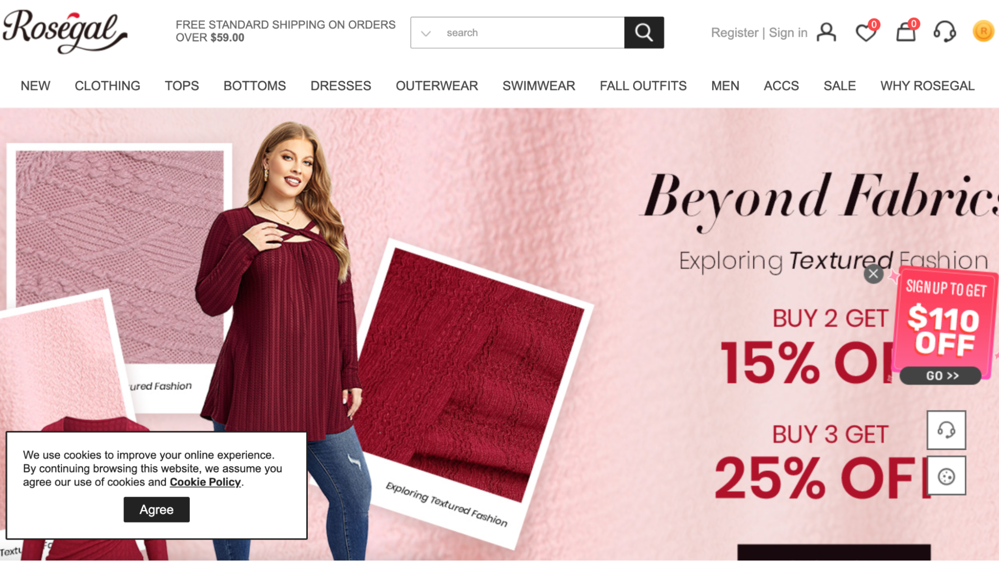
RoseGal’s search bar doesn’t offer much insight. What should visitors search for?

ShopStyle wants users to search for brand names and stores through the search bar on its homepage. By being specific, it lets people know what the search really entails.

Keep explanations short and simple. That minimizes misinterpretation or confusion. Use as few words as you can in your microcopy, but enough of them to clarify what you mean.
3. Generate good feelings
At times, putting a smile on people’s faces can defuse panic when they get stuck or see errors on your website after performing a particular action. Send good vibes through your microcopy to deliver a friendlier experience.
While this won’t work in every case, something that lightens up a visitor’s mood is a novelty most folks enjoy.
Microcopy examples
Here are a few common examples of microcopy by ecommerce brands:
-
Colourpop
-
Steven Madden
-
Böhme
-
Culture Kings
Colourpop

Colourpop uses microcopy to describe set expectations for its current promotion.
ColourPop uses the microcopy “Prices as marked. Limited time only or while supplies last. Cannot be combined with other promos” on its homepage to set clear expectations about pricing and promotions.
Let’s break it down by element:
-
“Prices as marked”: Informs customers that the prices they see are the final sale prices. They shouldn’t expect additional discounts to be applied at checkout.
-
“Limited time only”: Tells customers that the sale or promotion won’t last forever, nudging them to make a purchase sooner rather than later.
-
“Or while supplies last”: Another layer of urgency is added here. Even if the sale duration hasn’t expired, the promotion or discount will end if the stock runs out.
-
“Cannot be combined with other promos”: Clarifies the terms of the sale. Customers shouldn’t expect to stack multiple promotions or discount codes.
The copy encourages quicker buying decisions by creating a sense of urgency. It also reduces potential confusion or disputes later in the purchase process.
Steve Madden

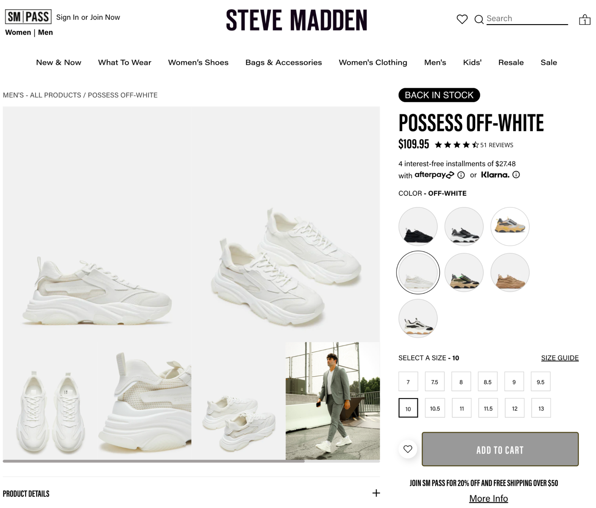
Steven Madden promotes SM Pass to customers on its product page.
Steve Madden uses the microcopy “Join SM Pass for 20% off and free shipping over $50” under the Add to Cart button to convey multiple pieces of information.
The placement under the Add to Cart button is strategic. Customers are in the decision-making phase when they’re about to add an item to the cart.
Let’s look at each piece of text:
-
“Join SM Pass”: This is a direct CTA. Steve Madden is highlighting an additional action customers can take, which is to join its loyalty or membership program named “SM PASS.”
-
“For 20% off”: This provides an immediate and tangible incentive for joining. A 20% discount is substantial, and by juxtaposing this offer with the process of adding an item to the cart, it’s suggesting that the customer can get a reduced price on their current purchase if they join.
-
“And free shipping over $50”: Shipping costs are often a point of contention for online shoppers. By offering free shipping for orders over a certain amount, Steve Madden is providing another incentive for the customer to join SM Pass.
The microcopy is designed to inform readers of the benefits of joining the SM Pass program and to nudge them toward actions that are favorable for both the business (more members and sales) and the customer (discounts and perks).
Böhme

Bohme’s uses microcopy to promote its return policy in its shopping cart.
Bohme’s smart use of microcopy in its shopping cart builds trust and reduces cart abandonment with shoppers. First, it has a progress bar that says how far away you are from free shipping. Underneath the progress bar, you’ll find the following text:
-
“Undecided?”: By starting with this question, Bohme immediately addresses a common sentiment among online shoppers: indecision. Many consumers hesitate to finalize a purchase due to concerns about the product, fit, or quality, or whether they truly need the item.
-
“Don’t worry”: A gentle nudge, suggesting that the following information will provide a solution or relief to the concern addressed by “Undecided?”
-
“You have 21 days to get your money back”: This is a straightforward and clear declaration about Bohme’s return policy. You learn the duration of the return window and are assured of a refund, which appeals to shoppers.
Bohme uses this microcopy to reassure browsers, provide clear information about its return policy, and potentially increase sales by reducing hesitation and cart abandonment.
Culture Kings

Culture Kings uses microcopy on its checkout page for various reasons.
Using specific microcopy on its checkout page, Culture Kings strategically targets different aspects of the user’s purchasing journey, aiming to optimize the shopping experience, grow its customer base, and increase sales.
-
“Email me with news and offers”: This message provides customers with a direct benefit (receiving news and special offers) in exchange for their email. It plays on the customer’s interest in staying updated and possibly getting exclusive deals or early access to sales.
-
“Gift card or discount code”: This text directly addresses the desire for people to save money or use gift cards. It might also be a subtle nudge for repeat purchases. If a customer knows they can get and use discount codes, they might be more inclined to shop again in the future.
-
“Express checkout”: A lengthy or complicated checkout process can deter customers and increase cart abandonment rates. By offering an express option like Shop Pay, Culture Kings ensures they cater to customers who want a fast and hassle-free purchase experience.
Each of these elements can contribute to increasing conversions. Whether it’s through enticing customers with potential future discounts, allowing them to use current discounts, or simplifying the checkout process, they’re all aligned toward making the sale.
Start working on your microcopy today
Although the process of polishing a website’s microcopy is straightforward, the focus of many ecommerce merchants wavers from it.
If you want to genuinely help your visitors, use microcopy to deliver precise direction where drop-offs occur. Whether it’s an error message or a promotion, the simple tips mentioned above will help you produce huge improvements for your store and your visitors’ experiences.
Read more
- What to Do After You've Lost a Loyal Customer
- 17 User-Generated Content Examples and 5 Tactics to Grow $15M+ in Annual Sales
- The Psychology of Hero Images: How to Hook Shoppers & Tell Your Story in 50 Milliseconds or Less
- A Strategy for Human Resources in our Current Climate
- Decoy Pricing: Secret Strategies Your Competitors Use to Get Customers to Spend More
- Marketing Calendars for 2018’s Holidays: Ecommerce, Social & Sales
- Ecommerce Site Search Best Practices: How to Sell More to the People Who Want to Buy Now
- Ecommerce Chatbots: 22 Ways to Increase Sales, Conversions & Retention
- Live Chat: The Most Underused Tool in Your Arsenal
- Microservices: Advantages and Disadvantages (And Whether They're Right For Your Business)
Writing microcopy FAQ
What is the difference between copywriting and microcopy?
Copywriting includes all types of written content used for marketing and advertising, aimed at persuading or informing. Microcopy is when you use an interface like a website or app, and can guide, inform, or motivate users.
How does microcopy work?
Microcopy ensures that people understand their next steps or the implications of their actions by providing concise, clear instructions at a specific point. By providing timely guidance, it enhances user experience and prevents potential confusion or friction.
What are the benefits of microcopy?
With microcopy, users get clarity, reduce friction points, and have an easier time using digital interfaces like a website. Microcopy can reinforce a brand’s voice and tone and increase conversions.


